鸿蒙HarmonyOS实战-ArkUI组件(Row/Column)
🚀前言
HarmonyOS的布局组件是一组用于构建用户界面布局的组件,包括线性布局、相对布局、网格布局等。这些组件帮助开发者以简单和灵活的方式管理和组织应用程序中的视图,并支持多种不同的设备屏幕尺寸和方向。使用HarmonyOS的布局组件可以提高应用程序的可读性和可维护性,并帮助快速构建适应不同设备的用户界面。
常见页面结构图:
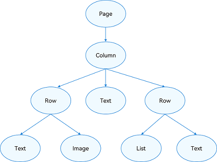
不就元素组成:
🚀一、Row/Column
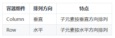
🔎1.线性布局
线性布局(LinearLayout)是一种常用的UI布局方式,通过线性容器 Row 和 Column 构建。线性布局是其他布局的基础,其子元素在线性方向上(水平方向和垂直方向)依次排列。线性布局的排列方向由所选容器组件决定,Column 容器内子元素按照垂直方向排列,Row 容器内子元素按照水平方向排列。根据不同的排列方向,开发者可选择使用 Row 或 Column 容器创建线性布局。线性布局的优点是可以根据不同的排列需求创建灵活的布局,同时也方便管理子元素的位置和大小。
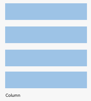
Column容器内子元素排列示意图:
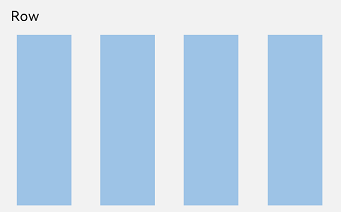
Row容器内子元素排列示意图:
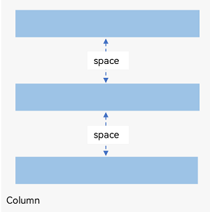
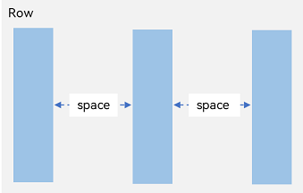
🔎2.间距
Column({ space: 20 })
Row({ space: 35 })
🔎3.对齐方式
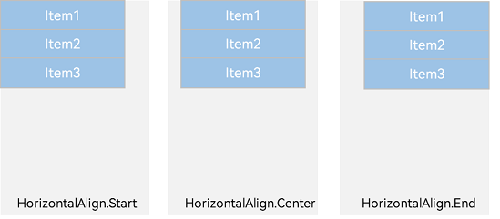
🦋3.1 水平对齐
Column({}) {}.alignItems(HorizontalAlign.Start)
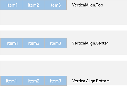
🦋3.2 垂直对齐
Column({}) {}.alignItems(VerticalAlign.Top)
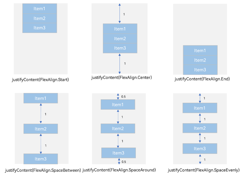
🔎4.排列方式
🦋4.1 水平排列
Column({}) {}.justifyContent(FlexAlign.Start)
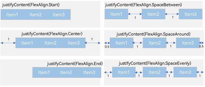
🦋4.2 垂直排列
Row({}) {}.justifyContent(FlexAlign.Start)
🔎5.自适应拉伸
🦋5.1 水平拉伸
因为自适应一般是讲宽度,其实高度也行,但原理一样
Column({}) {}.width('100%')

🔎6.自适应缩放
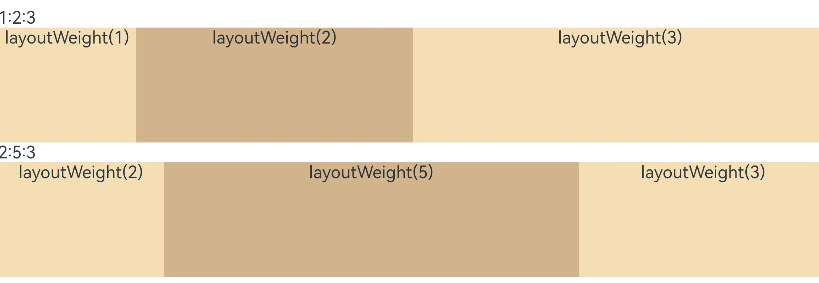
🦋6.1 权重
@Entry
@Component
struct layoutWeightExample {
  build() {
    Column() {
      Text('1:2:3').width('100%')
      Row() {
        Column() {
          Text('layoutWeight(1)')
            .textAlign(TextAlign.Center)
        }.layoutWeight(1).backgroundColor(0xF5DEB3).height('100%')

        Column() {
          Text('layoutWeight(2)')
            .textAlign(TextAlign.Center)
        }.layoutWeight(2).backgroundColor(0xD2B48C).height('100%')

        Column() {
          Text('layoutWeight(3)')
            .textAlign(TextAlign.Center)
        }.layoutWeight(3).backgroundColor(0xF5DEB3).height('100%')

      }.backgroundColor(0xffd306).height('30%')

      Text('2:5:3').width('100%')
      Row() {
        Column() {
          Text('layoutWeight(2)')
            .textAlign(TextAlign.Center)
        }.layoutWeight(2).backgroundColor(0xF5DEB3).height('100%')

        Column() {
          Text('layoutWeight(5)')
            .textAlign(TextAlign.Center)
        }.layoutWeight(5).backgroundColor(0xD2B48C).height('100%')

        Column() {
          Text('layoutWeight(3)')
            .textAlign(TextAlign.Center)
        }.layoutWeight(3).backgroundColor(0xF5DEB3).height('100%')
      }.backgroundColor(0xffd306).height('30%')
    }
  }
}
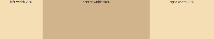
🦋6.2 百分比
@Entry
@Component
struct WidthExample {
  build() {
    Column() {
      Row() {
        Column() {
          Text('left width 20%')
            .textAlign(TextAlign.Center)
        }.width('20%').backgroundColor(0xF5DEB3).height('100%')

        Column() {
          Text('center width 50%')
            .textAlign(TextAlign.Center)
        }.width('50%').backgroundColor(0xD2B48C).height('100%')

        Column() {
          Text('right width 30%')
            .textAlign(TextAlign.Center)
        }.width('30%').backgroundColor(0xF5DEB3).height('100%')
      }.backgroundColor(0xffd306).height('30%')
    }
  }
}
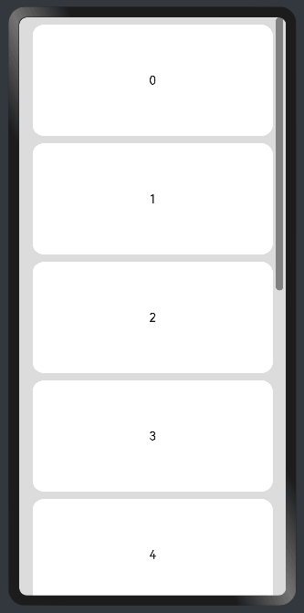
🔎7.Scroll组件自适应延伸
🦋7.1 列自适应延伸
@Entry
@Component
struct ScrollExample {
  scroller: Scroller = new Scroller();
  private arr: number[] = [0, 1, 2, 3, 4, 5, 6, 7, 8, 9];

  build() {
    Scroll(this.scroller) {
      Column() {
        ForEach(this.arr, (item) => {
          Text(item.toString())
            .width('90%')
            .height(150)
            .backgroundColor(0xFFFFFF)
            .borderRadius(15)
            .fontSize(16)
            .textAlign(TextAlign.Center)
            .margin({ top: 10 })
        }, item => item)
      }.width('100%')
    }
    .backgroundColor(0xDCDCDC)
    .scrollable(ScrollDirection.Vertical) // 滚动方向纵向
    .scrollBar(BarState.On) // 滚动条常驻显示
    .scrollBarColor(Color.Gray) // 滚动条颜色
    .scrollBarWidth(10) // 滚动条宽度
    .edgeEffect(EdgeEffect.Spring) // 滚动到边沿后回弹
  }
}
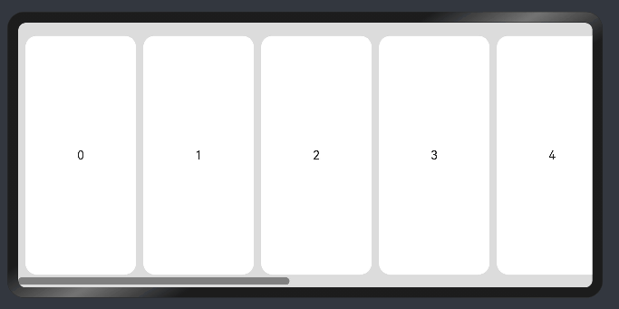
🦋7.2 行自适应延伸
@Entry
@Component
struct ScrollExample {
  scroller: Scroller = new Scroller();
  private arr: number[] = [0, 1, 2, 3, 4, 5, 6, 7, 8, 9];

  build() {
    Scroll(this.scroller) {
      Row() {
        ForEach(this.arr, (item) => {
          Text(item.toString())
            .height('90%')
            .width(150)
            .backgroundColor(0xFFFFFF)
            .borderRadius(15)
            .fontSize(16)
            .textAlign(TextAlign.Center)
            .margin({ left: 10 })
        })
      }.height('100%')
    }
    .backgroundColor(0xDCDCDC)
    .scrollable(ScrollDirection.Horizontal) // 滚动方向横向
    .scrollBar(BarState.On) // 滚动条常驻显示
    .scrollBarColor(Color.Gray) // 滚动条颜色
    .scrollBarWidth(10) // 滚动条宽度
    .edgeEffect(EdgeEffect.Spring) // 滚动到边沿后回弹
  }
}
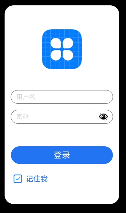
🚀二、登录案例
build() {
  Column({space:20}) {
    Image( 'logo .png')
    TextInput({placeholder:'用户名'})
    TextInput({placeholder:'密码'})
      .type(InputType.Password)
      .showPasswordIcon(true)
    Button('登录')
    Row(){
      Checkbox()
      Text('记住我')
        .fontColor('#36D')
    }
  }
  .height('100%')
}
执行效果:
🚀写在最后
- 如果你觉得这篇内容对你还蛮有帮助,我想邀请你帮我三个小忙:
- 点赞,转发,有你们的 『点赞和评论』,才是我创造的动力。
- 关注小编,同时可以期待后续文章ing🚀,不定期分享原创知识。
- 想要获取更多完整鸿蒙最新VIP学习资源以及最新技术知识点,请关注作者博客:https://t.doruo.cn/14DjR1rEY