HarmonyOS 开发入门(三)
HarmonyOS 开发入门(三)
日常逼逼叨
在开发入门(一)和开发入门(二)中我们描述了 HarmonyOS 开发的语言ArKTs以及Ts简单的入门级语法操作以及开发环境的搭建,接下来我们进入第三部分:HarmonyOS基础组件的开发,有任何说的不合理的地方,希望各位看官老爷批评指正🤣🤣
一、项目目录介绍
ArkTS工程目录结构(Stage模型)
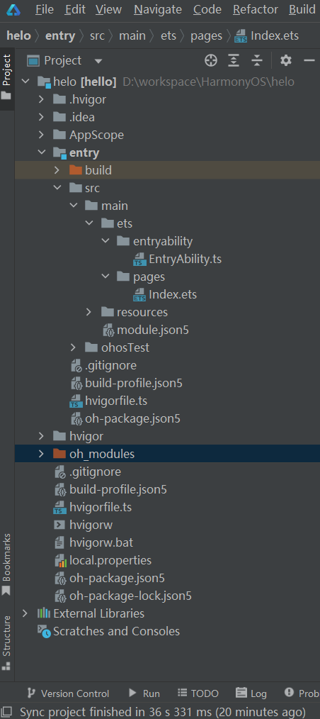
- AppScope > app.json5:应用的全局配置信息。
- entry:HarmonyOS工程模块,编译构建生成一个HAP包。
- src > main > ets:用于存放ArkTS源码。
- src > main > ets > entryability:应用/服务的入口。
- src > main > ets > pages:应用/服务包含的页面。
- src > main > resources:用于存放应用/服务所用到的资源文件,如图形、多媒体、字符串、布局文件等。
- src > main > module.json5:Stage模型模块配置文件。主要包含HAP包的配置信息、应用/服务在具体设备上的配置信息以及应用/服务的全局配置信息。
- build-profile.json5:当前的模块信息、编译信息配置项,包括buildOption、targets配置等。其中targets中可配置当前运行环境,默认为HarmonyOS。
- hvigorfile.ts:模块级编译构建任务脚本,开发者可以自定义相关任务和代码实现。
- oh_modules:用于存放三方库依赖信息。
- build-profile.json5:应用级配置信息,包括签名、产品配置等。
- hvigorfile.ts:应用级编译构建任务脚本。
二 、基础组件介绍
通过开发者文档可以看到,HarmonyOS中基于ArkTs的申明式组件提供了非常多的组件供开发者进行使用,下面将对于一些常用的组件进行简述,如果在开发中需要一些较为复杂的组件应用,可以参考官方组件
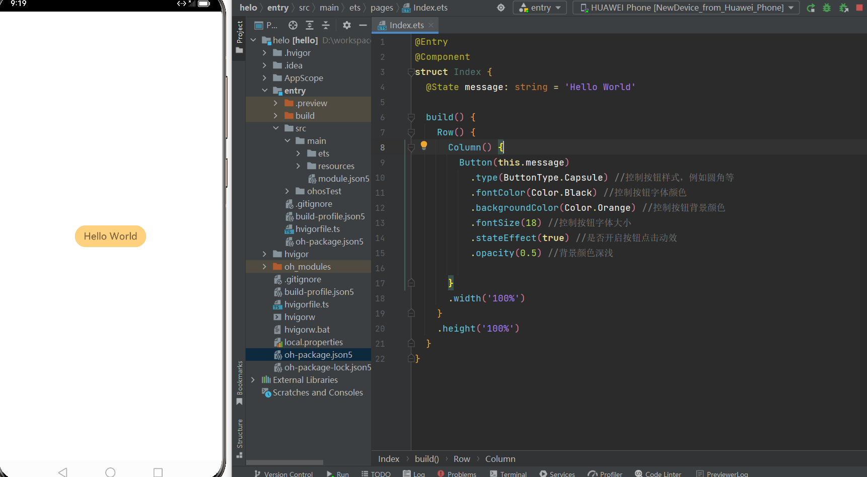
button
@Entry
@Component
struct Index {
  @State message: string = 'Hello World'

  build() {
    Row() {
      Column() {
        Button(this.message)//按钮显示文字
          .type(ButtonType.Capsule) //控制按钮样式,例如圆角等
          .fontColor(Color.Black) //控制按钮字体颜色
          .backgroundColor(Color.Orange) //控制按钮背景颜色
          .fontSize(18) //控制按钮字体大小
          .stateEffect(true) //是否开启按钮点击动效
          .opacity(0.5) //背景颜色深浅

      }
      .width('100%')
    }
    .height('100%')
  }
}
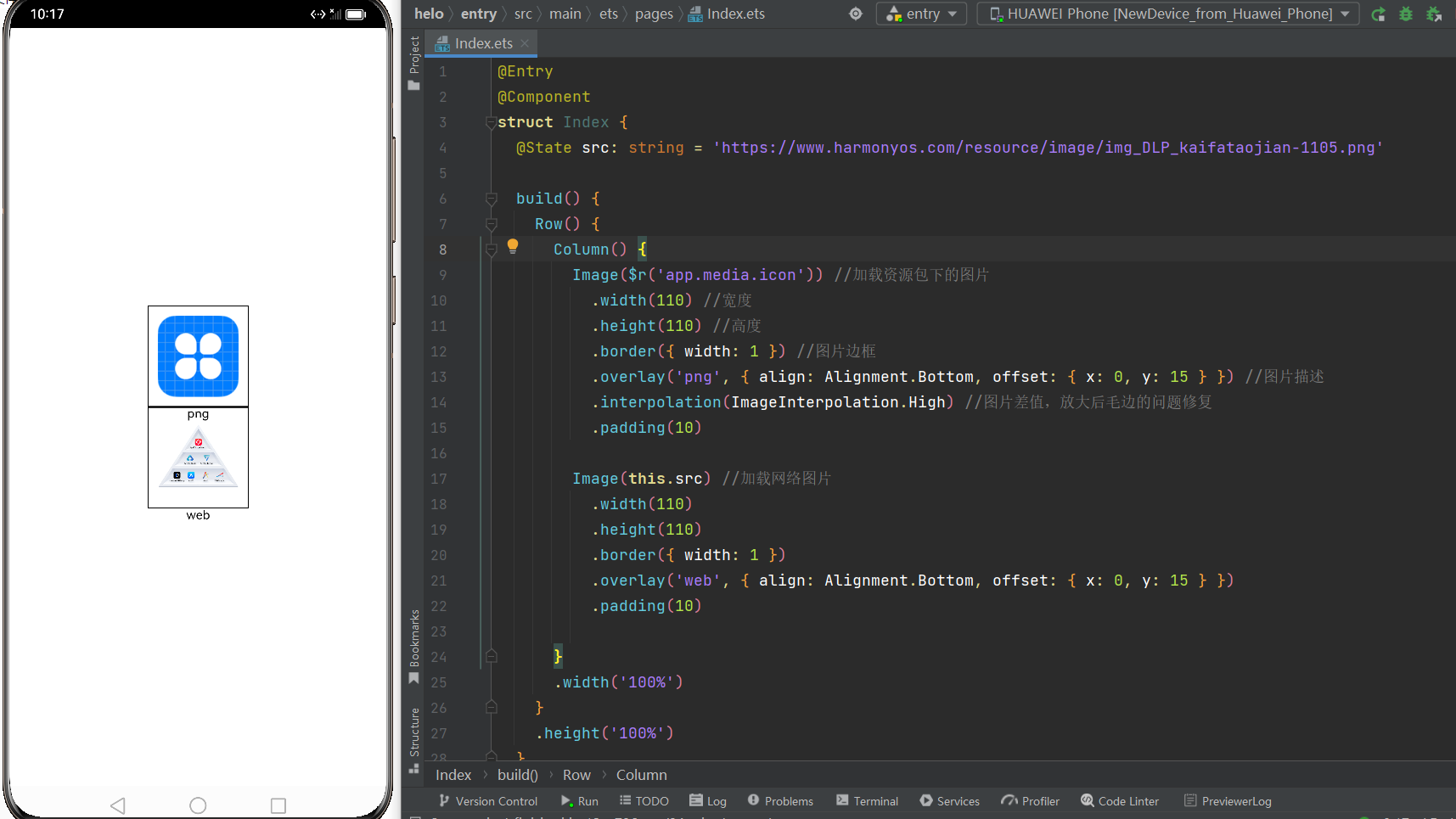
image
@Entry
@Component
struct Index {
  @State src: string = 'https://www.harmonyos.com/resource/image/img_DLP_kaifataojian-1105.png'

  build() {
    Row() {
      Column() {
        Image($r('app.media.icon')) //加载资源包下的图片
          .width(110) //宽度
          .height(110) //高度
          .border({ width: 1 }) //图片边框
          .overlay('png', { align: Alignment.Bottom, offset: { x: 0, y: 15 } }) //图片描述
          .interpolation(ImageInterpolation.High) //图片差值,放大后毛边的问题修复
          .padding(10)

        Image(this.src) //加载网络图片
          .width(110)
          .height(110)
          .border({ width: 1 })
          .overlay('web', { align: Alignment.Bottom, offset: { x: 0, y: 15 } })
          .padding(10)

      }
      .width('100%')
    }
    .height('100%')
  }
}
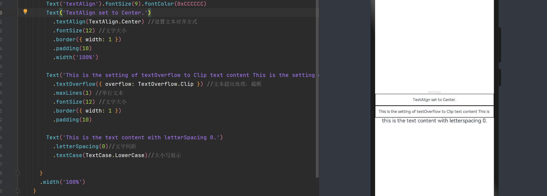
text
@Entry
@Component
struct Index {

  build() {
    Row() {
      Column() {
        Text('textAlign').fontSize(9).fontColor(0xCCCCCC)
        Text('TextAlign set to Center.')
          .textAlign(TextAlign.Center) //设置文本对齐方式
          .fontSize(12) //文字大小
          .border({ width: 1 })
          .padding(10)
          .width('100%')

        Text('This is the setting of textOverflow to Clip text content This is the setting of textOverflow to None text content. This is the setting of textOverflow to Clip text content This is the setting of textOverflow to None text content.')
          .textOverflow({ overflow: TextOverflow.Clip }) //文本超出处理:截断
          .maxLines(1) //单行文本
          .fontSize(12) //文字大小
          .border({ width: 1 })
          .padding(10)

        Text('This is the text content with letterSpacing 0.')
          .letterSpacing(0)//文字间距
          .textCase(TextCase.LowerCase)//大小写展示

      }
      .width('100%')
    }
    .height('100%')
  }
}
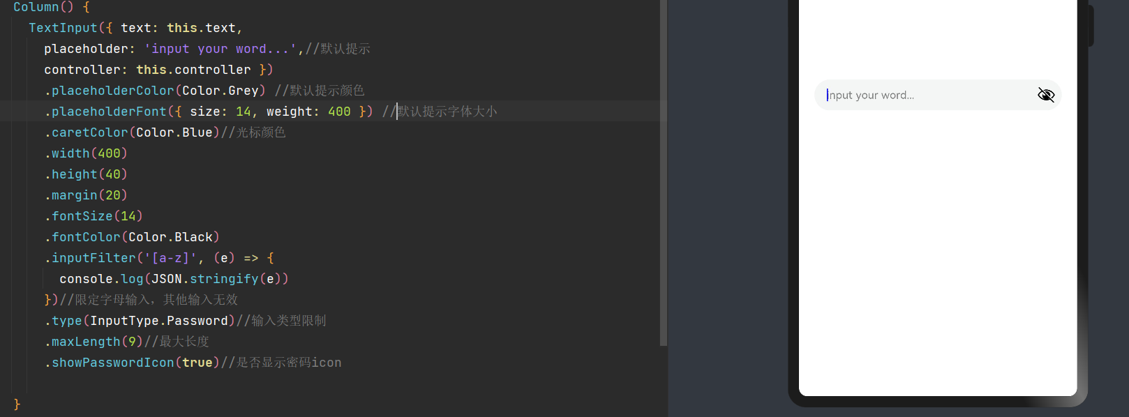
textInput
@Entry
@Component
struct Index {
  @State text: string = ''
  controller: TextInputController = new TextInputController()
  build() {
    Row() {
      Column() {
        TextInput({ text: this.text,
          placeholder: 'input your word...',//默认提示
          controller: this.controller })
          .placeholderColor(Color.Grey) //默认提示颜色
          .placeholderFont({ size: 14, weight: 400 }) //默认提示字体大小
          .caretColor(Color.Blue)//光标颜色
          .width(400)
          .height(40)
          .margin(20)
          .fontSize(14)
          .fontColor(Color.Black)
          .inputFilter('[a-z]', (e) => {
            console.log(JSON.stringify(e))
          })//限定字母输入,其他输入无效
          .type(InputType.Password)//输入类型限制
          .maxLength(9)//最大长度
          .showPasswordIcon(true)//是否显示密码icon

      }
      .width('100%')
    }
    .height('100%')
  }
}
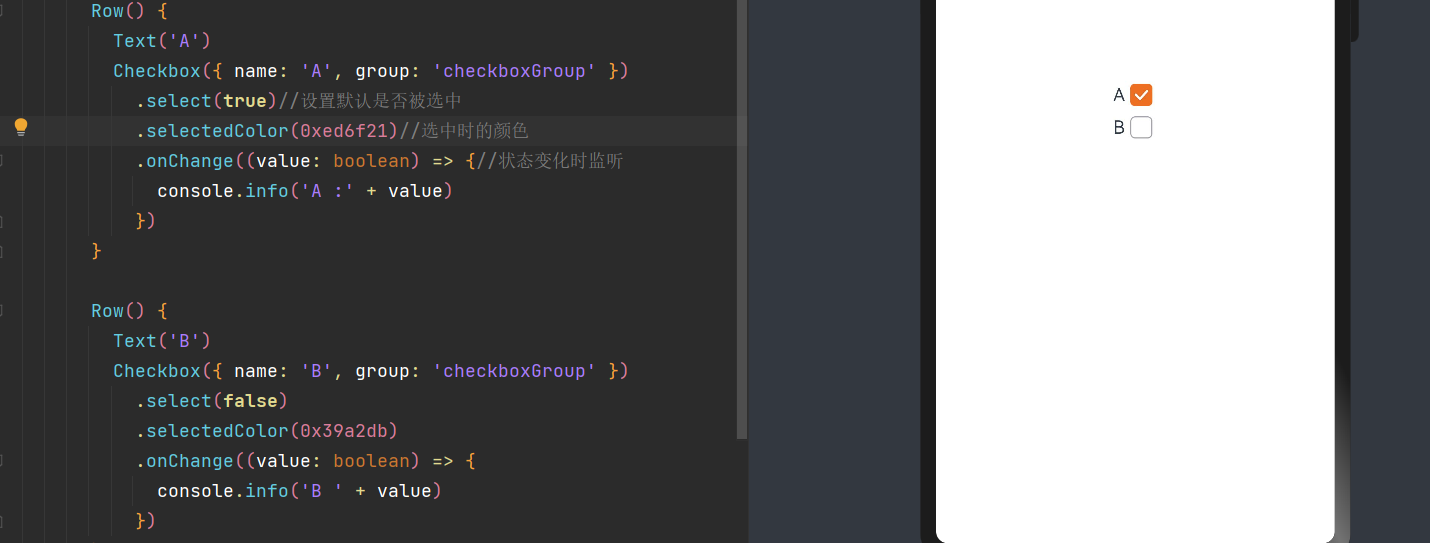
checkBox
@Entry
@Component
struct Index {
  @State text: string = ''

  build() {
    Row() {
      Column() {
        Row() {
          Text('A')
          Checkbox({ name: 'A', group: 'checkboxGroup' })
            .select(true)//设置默认是否被选中
            .selectedColor(0xed6f21)//选中时的颜色
            .onChange((value: boolean) => {//状态变化时监听
              console.info('A :' + value)
            })
        }

        Row() {
          Text('B')
          Checkbox({ name: 'B', group: 'checkboxGroup' })
            .select(false)
            .selectedColor(0x39a2db)
            .onChange((value: boolean) => {
              console.info('B ' + value)
            })
        }

      }
      .width('100%')
    }
    .height('100%')
  }
}
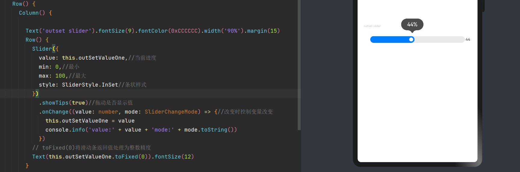
slider
@Entry
@Component
struct Index {
  @State outSetValueOne: number = 40
  @State inSetValueOne: number = 40
  @State outSetValueTwo: number = 40

  build() {
    Row() {
      Column() {

        Text('outset slider').fontSize(9).fontColor(0xCCCCCC).width('90%').margin(15)
        Row() {
          Slider({
            value: this.outSetValueOne,//当前进度
            min: 0,//最小
            max: 100,//最大
            style: SliderStyle.InSet//条状样式
          })
            .showTips(true)//拖动是否显示值
            .onChange((value: number, mode: SliderChangeMode) => {//改变时控制变量改变
              this.outSetValueOne = value
              console.info('value:' + value + 'mode:' + mode.toString())
            })
          // toFixed(0)将滑动条返回值处理为整数精度
          Text(this.outSetValueOne.toFixed(0)).fontSize(12)
        }
        .width('80%')
      }
      .width('100%')
    }
    .height('100%')
  }
}
三、事件介绍
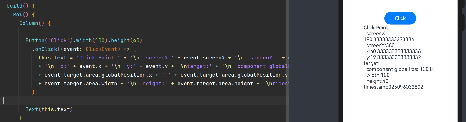
点击事件
-
所谓点击事件简单来说就是组件被点击时触发的事件,通常与按钮等组件进行搭配使用
@Entry
@Component
struct Index {
  @State text: string = '40'


  build() {
    Row() {
      Column() {

        Button('Click').width(100).height(40)
          .onClick((event: ClickEvent) => {
            this.text = 'Click Point:' + '\n  screenX:' + event.screenX + '\n  screenY:' + event.screenY
            + '\n  x:' + event.x + '\n  y:' + event.y + '\ntarget:' + '\n  component globalPos:('
            + event.target.area.globalPosition.x + ',' + event.target.area.globalPosition.y + ')\n  width:'
            + event.target.area.width + '\n  height:' + event.target.area.height + '\ntimestamp' + event.timestamp;
          })

        Text(this.text)
      }
      .width('100%')
    }
    .height('100%')
  }
}
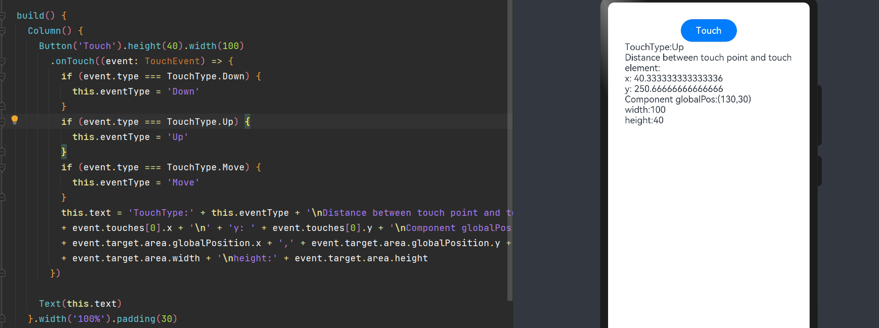
触摸事件
- 所谓触摸事件,既当手指在组件上按下、滑动、抬起时触发。 对应的相关属性有按压,抬起,拖拽等
@Entry
@Component
struct Index {
  @State text: string = ''
  @State eventType: string = ''

  build() {
    Column() {
      Button('Touch').height(40).width(100)
        .onTouch((event: TouchEvent) => {
          if (event.type === TouchType.Down) {
            this.eventType = 'Down'
          }
          if (event.type === TouchType.Up) {
            this.eventType = 'Up'
          }
          if (event.type === TouchType.Move) {
            this.eventType = 'Move'
          }
          this.text = 'TouchType:' + this.eventType + '\nDistance between touch point and touch element:\nx: '
          + event.touches[0].x + '\n' + 'y: ' + event.touches[0].y + '\nComponent globalPos:('
          + event.target.area.globalPosition.x + ',' + event.target.area.globalPosition.y + ')\nwidth:'
          + event.target.area.width + '\nheight:' + event.target.area.height
        })

      Text(this.text)
    }.width('100%').padding(30)
  }
}
更多事件监听详情可以参照官网
四、布局介绍
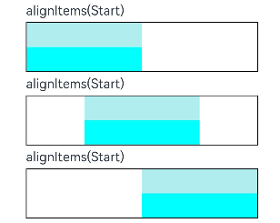
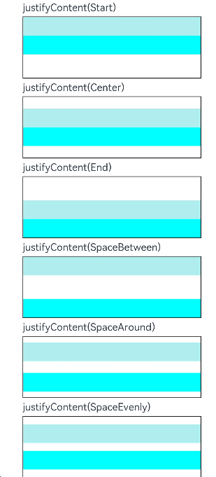
列容器
列容器既Column容器, 沿垂直方向布局的容器。
对于列容器来说,比较重要的参数有两个
-
alignItems : 设置子组件在水平方向上的对齐格式。
-
justifyContent8+ :设置子组件在垂直方向上的对齐格式。
@Entry
@Component
struct Index {
  @State text: string = ''
  @State eventType: string = ''

  build() {
    List() {
      ListItem() {
        Column({ space: 5 }) {

          // 设置子元素水平方向对齐方式 Start
          Text('alignItems(Start)').width('90%')
          Column() {
            Column().width('50%').height(30).backgroundColor(0xAFEEEE)
            Column().width('50%').height(30).backgroundColor(0x00FFFF)
          }.alignItems(HorizontalAlign.Start)
          .width('90%').border({ width: 1 })


          // 设置子元素水平方向对齐方式 center
          Text('alignItems(Start)').width('90%')
          Column() {
            Column().width('50%').height(30).backgroundColor(0xAFEEEE)
            Column().width('50%').height(30).backgroundColor(0x00FFFF)
          }.alignItems(HorizontalAlign.Center).width('90%').border({ width: 1 })


          // 设置子元素水平方向对齐方式 end
          Text('alignItems(Start)').width('90%')
          Column() {
            Column().width('50%').height(30).backgroundColor(0xAFEEEE)
            Column().width('50%').height(30).backgroundColor(0x00FFFF)
          }.alignItems(HorizontalAlign.End).width('90%').border({ width: 1 })


          // 设置子元素垂直方向的对齐方式 start
          Text('justifyContent(Start)').width('90%')
          Column() {
            Column().width('90%').height(30).backgroundColor(0xAFEEEE)
            Column().width('90%').height(30).backgroundColor(0x00FFFF)
          }.height(100).border({ width: 1 }).justifyContent(FlexAlign.Start)

          Text('justifyContent(Center)').width('90%')
          Column() {
            Column().width('90%').height(30).backgroundColor(0xAFEEEE)
            Column().width('90%').height(30).backgroundColor(0x00FFFF)
          }.height(100).border({ width: 1 }).justifyContent(FlexAlign.Center)


          Text('justifyContent(End)').width('90%')
          Column() {
            Column().width('90%').height(30).backgroundColor(0xAFEEEE)
            Column().width('90%').height(30).backgroundColor(0x00FFFF)
          }.height(100).border({ width: 1 }).justifyContent(FlexAlign.End)


          Text('justifyContent(SpaceBetween)').width('90%')
          Column() {
            Column().width('90%').height(30).backgroundColor(0xAFEEEE)
            Column().width('90%').height(30).backgroundColor(0x00FFFF)
          }.height(100).border({ width: 1 }).justifyContent(FlexAlign.SpaceBetween)


          Text('justifyContent(SpaceAround)').width('90%')
          Column() {
            Column().width('90%').height(30).backgroundColor(0xAFEEEE)
            Column().width('90%').height(30).backgroundColor(0x00FFFF)
          }.height(100).border({ width: 1 }).justifyContent(FlexAlign.SpaceAround)


          Text('justifyContent(SpaceEvenly)').width('90%')
          Column() {
            Column().width('90%').height(30).backgroundColor(0xAFEEEE)
            Column().width('90%').height(30).backgroundColor(0x00FFFF)
          }.height(100).border({ width: 1 }).justifyContent(FlexAlign.SpaceEvenly)


        }
      }.margin({left:40,top:15})
    }

  }
}
- 效果演示:
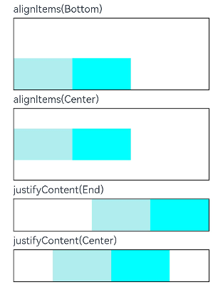
行容器
行容器既Row容器, 沿垂直方向布局的容器。
对于行容器来说,比较重要的参数有两个
-
alignItems : 设置子组件在垂直方向上的对齐格式。
-
justifyContent8+ :设置子组件在垂直水平方向上的对齐格式。
@Entry
@Component
struct Index {
  @State text: string = ''
  @State eventType: string = ''

  build() {
    List() {
      ListItem() {
        Column({ space: 5 }) {

          // 设置子元素垂直方向对齐方式
          Text('alignItems(Bottom)').width('90%')
          Row() {
            Row().width('30%').height(50).backgroundColor(0xAFEEEE)
            Row().width('30%').height(50).backgroundColor(0x00FFFF)
          }.width('90%').alignItems(VerticalAlign.Bottom).height('15%').border({ width: 1 })

          Text('alignItems(Center)').width('90%')
          Row() {
            Row().width('30%').height(50).backgroundColor(0xAFEEEE)
            Row().width('30%').height(50).backgroundColor(0x00FFFF)
          }.width('90%').alignItems(VerticalAlign.Center).height('15%').border({ width: 1 })


          // 设置子元素水平方向对齐方式
          Text('justifyContent(End)').width('90%')
          Row() {
            Row().width('30%').height(50).backgroundColor(0xAFEEEE)
            Row().width('30%').height(50).backgroundColor(0x00FFFF)
          }.width('90%').border({ width: 1 }).justifyContent(FlexAlign.End)

          Text('justifyContent(Center)').width('90%')
          Row() {
            Row().width('30%').height(50).backgroundColor(0xAFEEEE)
            Row().width('30%').height(50).backgroundColor(0x00FFFF)
          }.width('90%').border({ width: 1 }).justifyContent(FlexAlign.Center)
        }.width('100%')
        }
      }.margin({left:15,top:15})
    }


}
- 效果展示
上文中所提及到的组件,事件监听,布局均为最基础的布局,如果在后续开发过程中需要用到更为高级的一些组件以及布局,请参考官方API
如果喜欢我的分享,还请一键三连 叮叮叮~~