鸿蒙HarmonyOS实战-ArkUI组件(Button)
🚀一、Button
Button(按钮)是一种常见的用户界面控件,通常用于触发操作或提交数据。Button 拥有文本标签和一个可点击的区域,用户点击该区域即可触发相应的操作或事件。
Button 的主要功能有:
-
触发操作:用户点击 Button 可以触发相应的操作,例如提交表单、搜索、切换页面等。
-
提交数据:Button 可以用于提交表单数据,将用户输入的数据提交到服务器进行处理。
-
执行命令:Button 可以执行系统或应用程序的命令,例如打印、保存、退出等。
-
触发事件:Button 可以触发自定义事件,通过与其他组件配合使用,可以实现复杂的交互效果。
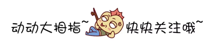
🔎1.创建按钮
语法说明:
Button(label?: string, options?: { type?: ButtonType, stateEffect?: boolean })
Button(options?: {type?: ButtonType, stateEffect?: boolean})
使用:
@Entry
@Component
struct Index {
  build() {
    Column(){
      Button('Ok', { type: ButtonType.Normal, stateEffect: true })
        .borderRadius(8)
        .backgroundColor(0x317aff)
        .width(90)
        .height(40)
      Button({ type: ButtonType.Normal, stateEffect: true }) {
        Row() {
          Image($r('app.media.app_icon')).width(20).height(40).margin({ left: 12 })
          Text('loading').fontSize(12).fontColor(0xffffff).margin({ left: 5, right: 12 })
        }.alignItems(VerticalAlign.Center)
      }.borderRadius(8).backgroundColor(0x317aff).width(90).height(40)
    }
  }
}
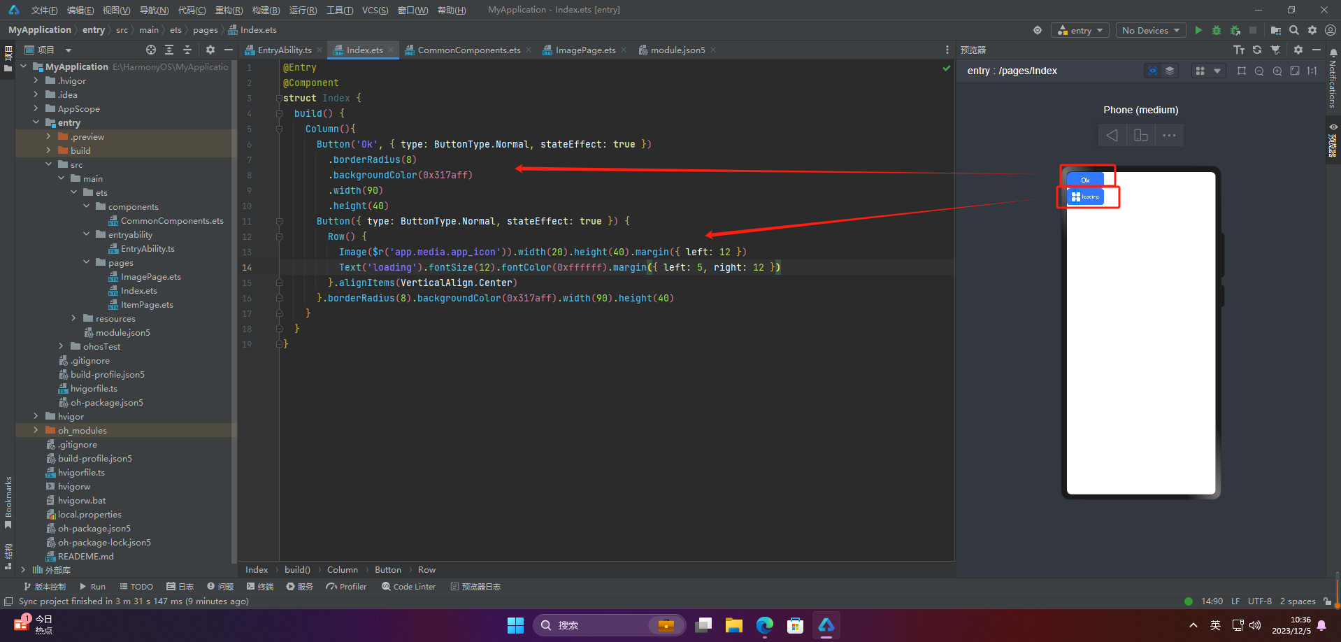
🔎2.设置按钮类型
@Entry
@Component
struct Index {
  build() {
    Column(){
      Button('Disable', { type: ButtonType.Capsule, stateEffect: false })
        .backgroundColor(0x317aff)
        .width(90)
        .height(40)
      Button('Circle', { type: ButtonType.Circle, stateEffect: false })
        .backgroundColor(0x317aff)
        .width(90)
        .height(90)
      Button('Circle', { type: ButtonType.Normal, stateEffect: false })
        .backgroundColor(0x317aff)
        .width(90)
        .height(90)
    }
  }
}
注意:不支持通过borderRadius属性重新设置
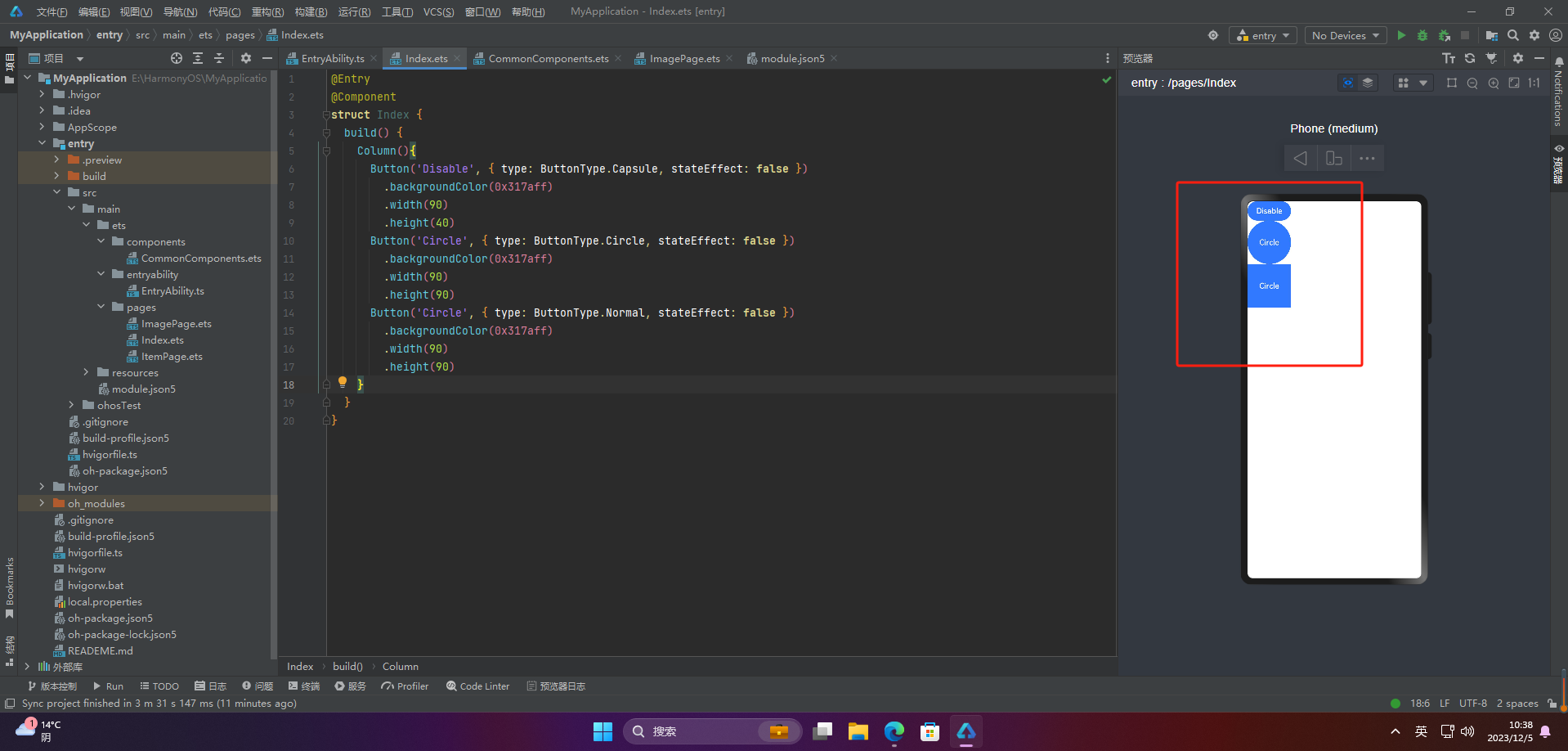
🔎3.自定义样式
@Entry
@Component
struct Index {
  build() {
    Column(){
      Button('circle border', { type: ButtonType.Normal })
        .borderRadius(20)
        .height(40)
      Button('font style', { type: ButtonType.Normal })
        .fontSize(20)
        .fontColor(Color.Pink)
        .fontWeight(800)
      Button('background color').backgroundColor(0xF55A42)
      Button({ type: ButtonType.Circle, stateEffect: true }) {
        Image($r('app.media.ic_public_refresh')).width(30).height(30)
      }.width(55).height(55).margin({ left: 20 }).backgroundColor(0xF55A42)
    }
  }
}
🔎4.添加事件
Button('Ok', { type: ButtonType.Normal, stateEffect: true })
  .onClick(()=>{
    console.info('Button onClick')
  })
🔎5.案例
Button按钮的实际应用场景主要包括以下几个方面:
点击提交表单
当用户填写完表单后,点击Button按钮来提交表单数据,使得数据能够被服务器端处理或者保存到数据库中。
跳转链接
当用户点击Button按钮时,跳转到指定的网页、应用程序或者其他页面。
打开或关闭弹窗
当用户点击Button按钮时,打开或关闭弹窗,可以在弹窗中展示一些信息、广告或者提示。
执行某个动作
当用户点击Button按钮时,执行某个操作,比如刷新页面、播放音乐、暂停视频等。
切换页面状态
当用户点击Button按钮时,可以切换页面的状态,比如打开或关闭菜单、切换语言、切换主题等。
Button按钮的应用场景非常广泛,基本上所有需要用户交互的场景都可以使用Button按钮来实现。
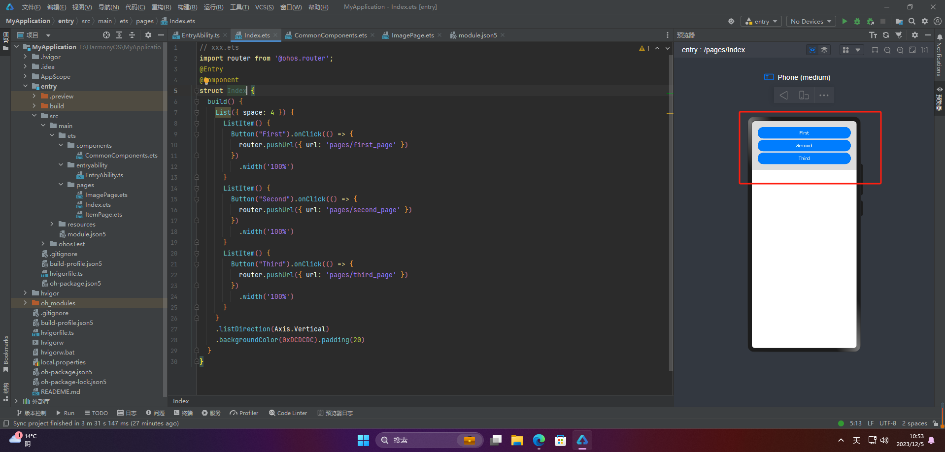
🦋2.1 页面跳转
// xxx.ets
import router from '@ohos.router';
@Entry
@Component
struct ButtonCase1 {
  build() {
    List({ space: 4 }) {
      ListItem() {
        Button("First").onClick(() => {
          router.pushUrl({ url: 'pages/first_page' })
        })
          .width('100%')
      }
      ListItem() {
        Button("Second").onClick(() => {
          router.pushUrl({ url: 'pages/second_page' })
        })
          .width('100%')
      }
      ListItem() {
        Button("Third").onClick(() => {
          router.pushUrl({ url: 'pages/third_page' })
        })
          .width('100%')
      }
    }
    .listDirection(Axis.Vertical)
    .backgroundColor(0xDCDCDC).padding(20)
  }
}
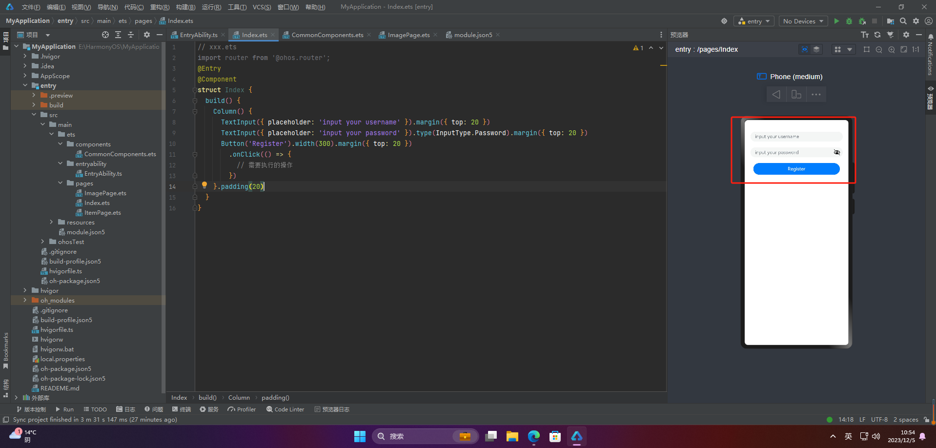
🦋2.2 表单提交
// xxx.ets
import router from '@ohos.router';
@Entry
@Component
struct Index {
  build() {
    Column() {
      TextInput({ placeholder: 'input your username' }).margin({ top: 20 })
      TextInput({ placeholder: 'input your password' }).type(InputType.Password).margin({ top: 20 })
      Button('Register').width(300).margin({ top: 20 })
        .onClick(() => {
          // 需要执行的操作
        })
    }.padding(20)
  }
}
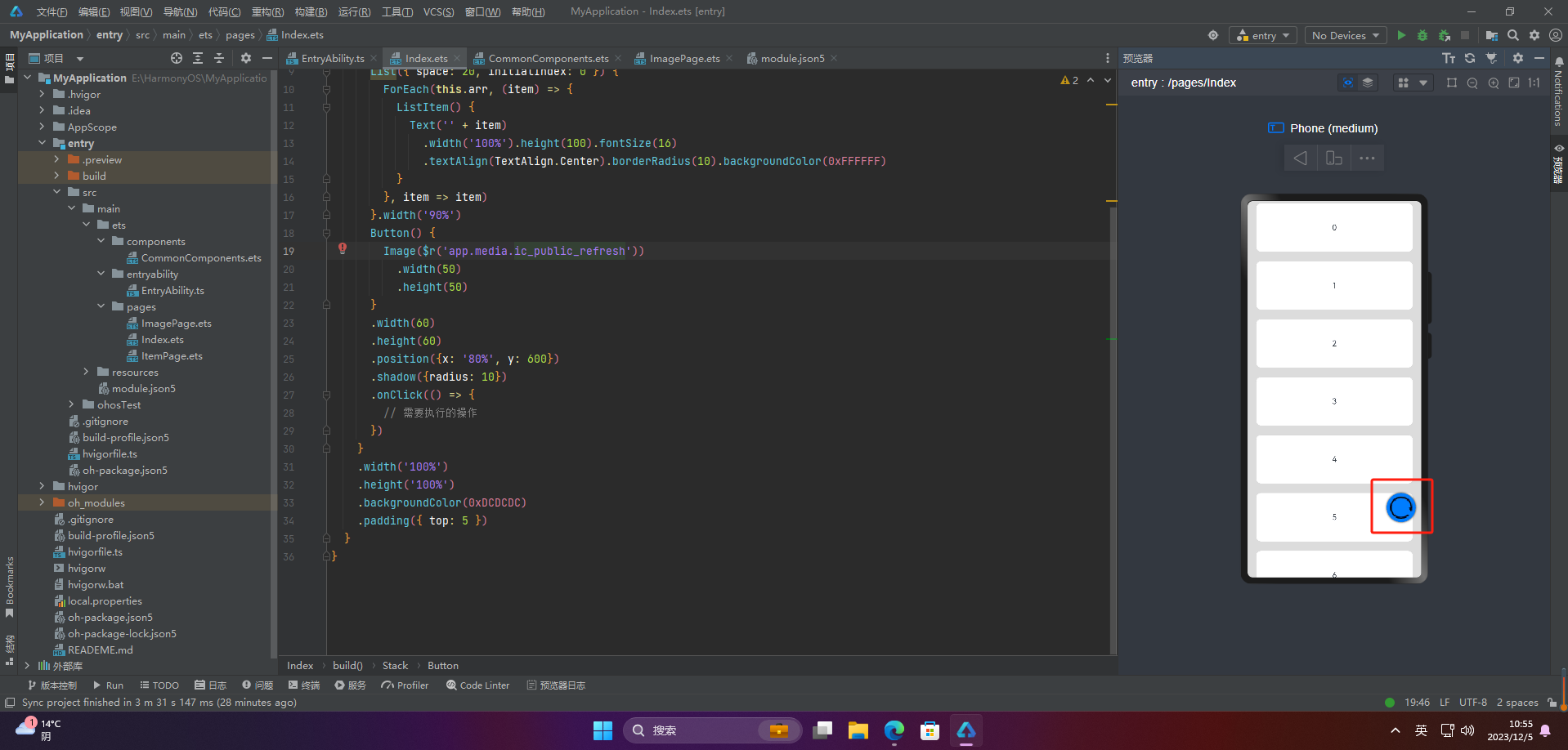
🦋2.3 悬浮按钮
// xxx.ets
import router from '@ohos.router';
@Entry
@Component
struct Index {
  private arr: number[] = [0, 1, 2, 3, 4, 5, 6, 7, 8, 9]
  build() {
    Stack() {
      List({ space: 20, initialIndex: 0 }) {
        ForEach(this.arr, (item) => {
          ListItem() {
            Text('' + item)
              .width('100%').height(100).fontSize(16)
              .textAlign(TextAlign.Center).borderRadius(10).backgroundColor(0xFFFFFF)
          }
        }, item => item)
      }.width('90%')
      Button() {
        Image($r('app.media.ic_public_refresh'))
          .width(50)
          .height(50)
      }
      .width(60)
      .height(60)
      .position({x: '80%', y: 600})
      .shadow({radius: 10})
      .onClick(() => {
        // 需要执行的操作
      })
    }
    .width('100%')
    .height('100%')
    .backgroundColor(0xDCDCDC)
    .padding({ top: 5 })
  }
}
🚀写在最后
- 如果你觉得这篇内容对你还蛮有帮助,我想邀请你帮我三个小忙:
- 点赞,转发,有你们的 『点赞和评论』,才是我创造的动力。
- 关注小编,同时可以期待后续文章ing🚀,不定期分享原创知识。
- 更多鸿蒙最新技术知识点,请关注作者博客:https://t.doruo.cn/14DjR1rEY