鸿蒙HarmonyOS实战-ArkUI组件(Progress)
🚀一、Progress
Progress组件是一种用户界面(UI)元素,用于向用户显示某些任务的进度。它通常以进度条的形式出现,显示任务完成的百分比。Progress组件可以在确定任务持续时间未知的情况下提供有用的反馈,帮助用户了解任务的状态和进度。
在Web应用程序中,Progress组件通常是使用HTML5的
-
在Android应用程序中,Progress组件通常是使用ProgressBar控件来实现的。ProgressBar控件可以在水平或垂直方向上显示进度条,还可以使用自定义颜色和样式。
-
在iOS应用程序中,Progress组件通常是使用UIProgressView控件来实现的。UIProgressView控件可以在水平或垂直方向上显示进度条,还可以使用自定义颜色和样式。
-
在HarmonyOS应用程序中,Progress组件通常是使用Progress控件来实现的。Progress控件可以在水平或垂直方向上显示进度条,还可以使用自定义颜色和样式。
🔎1.创建进度条
语法说明:
Progress(options: {value: number, total?: number, type?: ProgressType})
使用:
// xxx.ets
import promptAction from '@ohos.promptAction';
@Entry
@Component
struct Index {
build() {
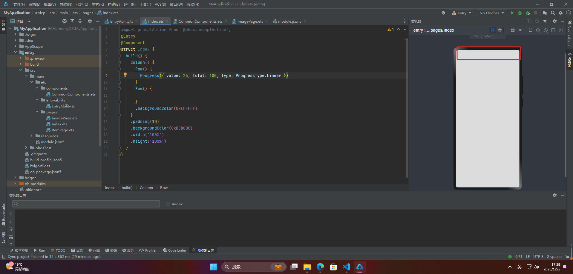
Column() {
Row() {
Progress({ value: 24, total: 100, type: ProgressType.Linear })
}
Row() {
}
.backgroundColor(0xFFFFFF)
}
.padding(10)
.backgroundColor(0xDCDCDC)
.width('100%')
.height('100%')
}
}
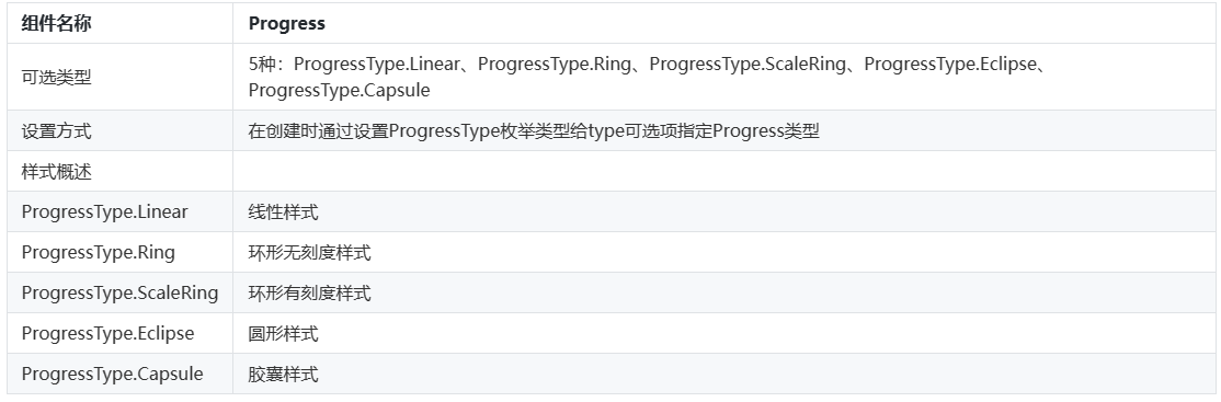
🔎2.设置进度条样式
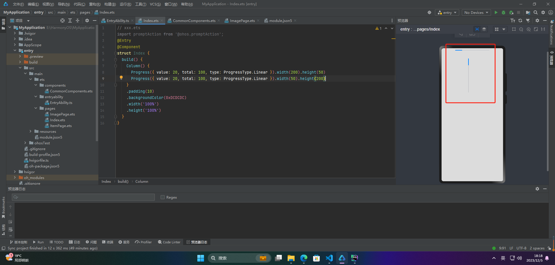
🦋2.1 线性样式
@Entry
@Component
struct Index {
  build() {
    Column() {
      Progress({ value: 20, total: 100, type: ProgressType.Linear }).width(200).height(50)
      Progress({ value: 20, total: 100, type: ProgressType.Linear }).width(50).height(200)
    }
    .padding(10)
    .backgroundColor(0xDCDCDC)
    .width('100%')
    .height('100%')
  }
}
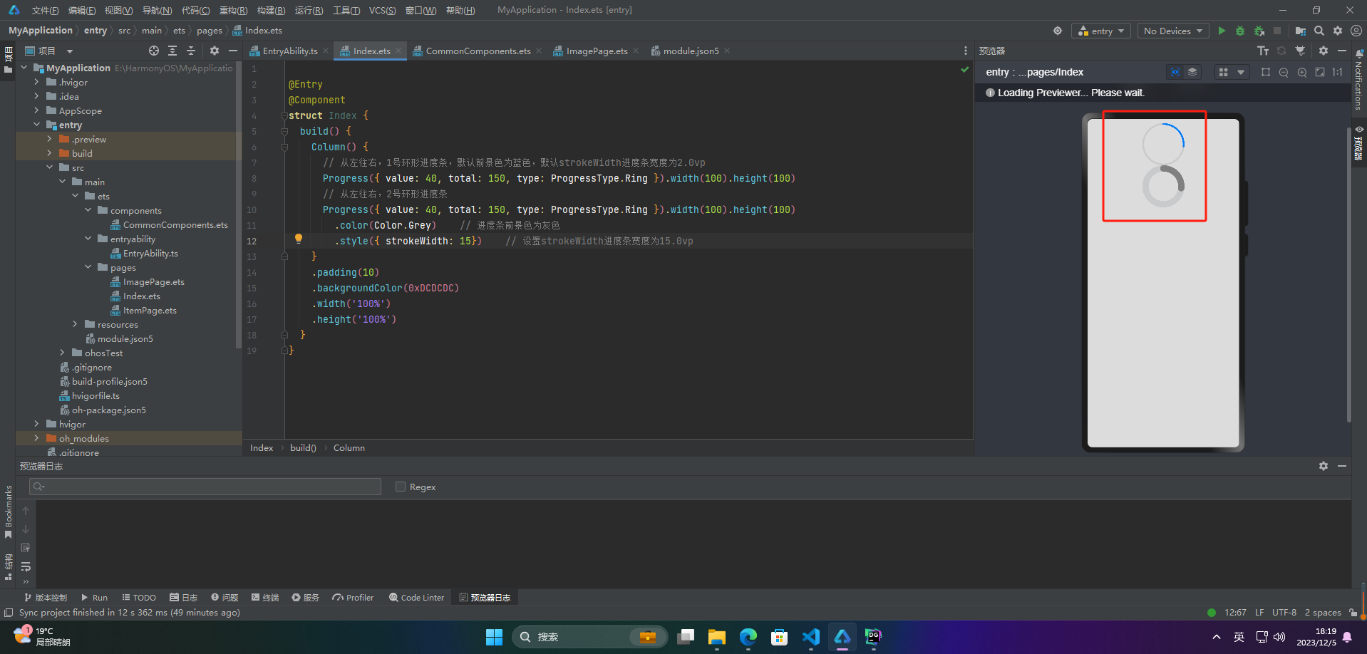
🦋2.2 环形无刻度样式
@Entry
@Component
struct Index {
  build() {
    Column() {
      // 从左往右,1号环形进度条,默认前景色为蓝色,默认strokeWidth进度条宽度为2.0vp
      Progress({ value: 40, total: 150, type: ProgressType.Ring }).width(100).height(100)
      // 从左往右,2号环形进度条
      Progress({ value: 40, total: 150, type: ProgressType.Ring }).width(100).height(100)
        .color(Color.Grey)    // 进度条前景色为灰色
        .style({ strokeWidth: 15})    // 设置strokeWidth进度条宽度为15.0vp
    }
    .padding(10)
    .backgroundColor(0xDCDCDC)
    .width('100%')
    .height('100%')
  }
}
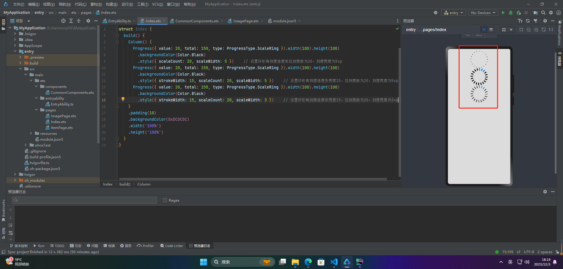
🦋2.3 环形有刻度样式
@Entry
@Component
struct Index {
  build() {
    Column() {
      Progress({ value: 20, total: 150, type: ProgressType.ScaleRing }).width(100).height(100)
        .backgroundColor(Color.Black)
        .style({ scaleCount: 20, scaleWidth: 5 })    // 设置环形有刻度进度条总刻度数为20,刻度宽度为5vp
      Progress({ value: 20, total: 150, type: ProgressType.ScaleRing }).width(100).height(100)
        .backgroundColor(Color.Black)
        .style({ strokeWidth: 15, scaleCount: 20, scaleWidth: 5 })    // 设置环形有刻度进度条宽度15,总刻度数为20,刻度宽度为5vp
      Progress({ value: 20, total: 150, type: ProgressType.ScaleRing }).width(100).height(100)
        .backgroundColor(Color.Black)
        .style({ strokeWidth: 15, scaleCount: 20, scaleWidth: 3 })    // 设置环形有刻度进度条宽度15,总刻度数为20,刻度宽度为3vp
    }
    .padding(10)
    .backgroundColor(0xDCDCDC)
    .width('100%')
    .height('100%')
  }
}
🦋2.4 圆形样式
@Entry
@Component
struct Index {
  build() {
    Column() {
      // 从左往右,1号圆形进度条,默认前景色为蓝色
      Progress({ value: 10, total: 150, type: ProgressType.Eclipse }).width(100).height(100)
      // 从左往右,2号圆形进度条,指定前景色为灰色
      Progress({ value: 20, total: 150, type: ProgressType.Eclipse }).color(Color.Grey).width(100).height(100)
    }
    .padding(10)
    .backgroundColor(0xDCDCDC)
    .width('100%')
    .height('100%')
  }
}

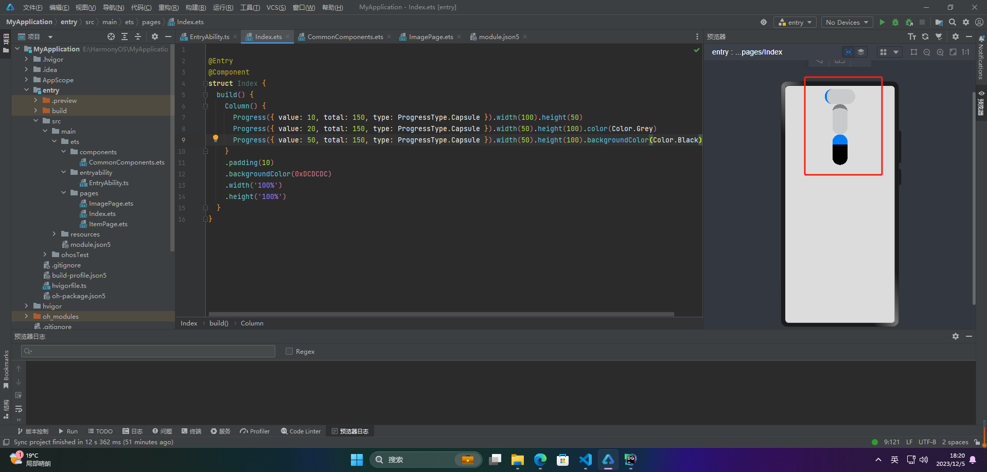
🦋2.5 胶囊样式
@Entry
@Component
struct Index {
  build() {
    Column() {
      Progress({ value: 10, total: 150, type: ProgressType.Capsule }).width(100).height(50)
      Progress({ value: 20, total: 150, type: ProgressType.Capsule }).width(50).height(100).color(Color.Grey)
      Progress({ value: 50, total: 150, type: ProgressType.Capsule }).width(50).height(100).backgroundColor(Color.Black)
    }
    .padding(10)
    .backgroundColor(0xDCDCDC)
    .width('100%')
    .height('100%')
  }
}
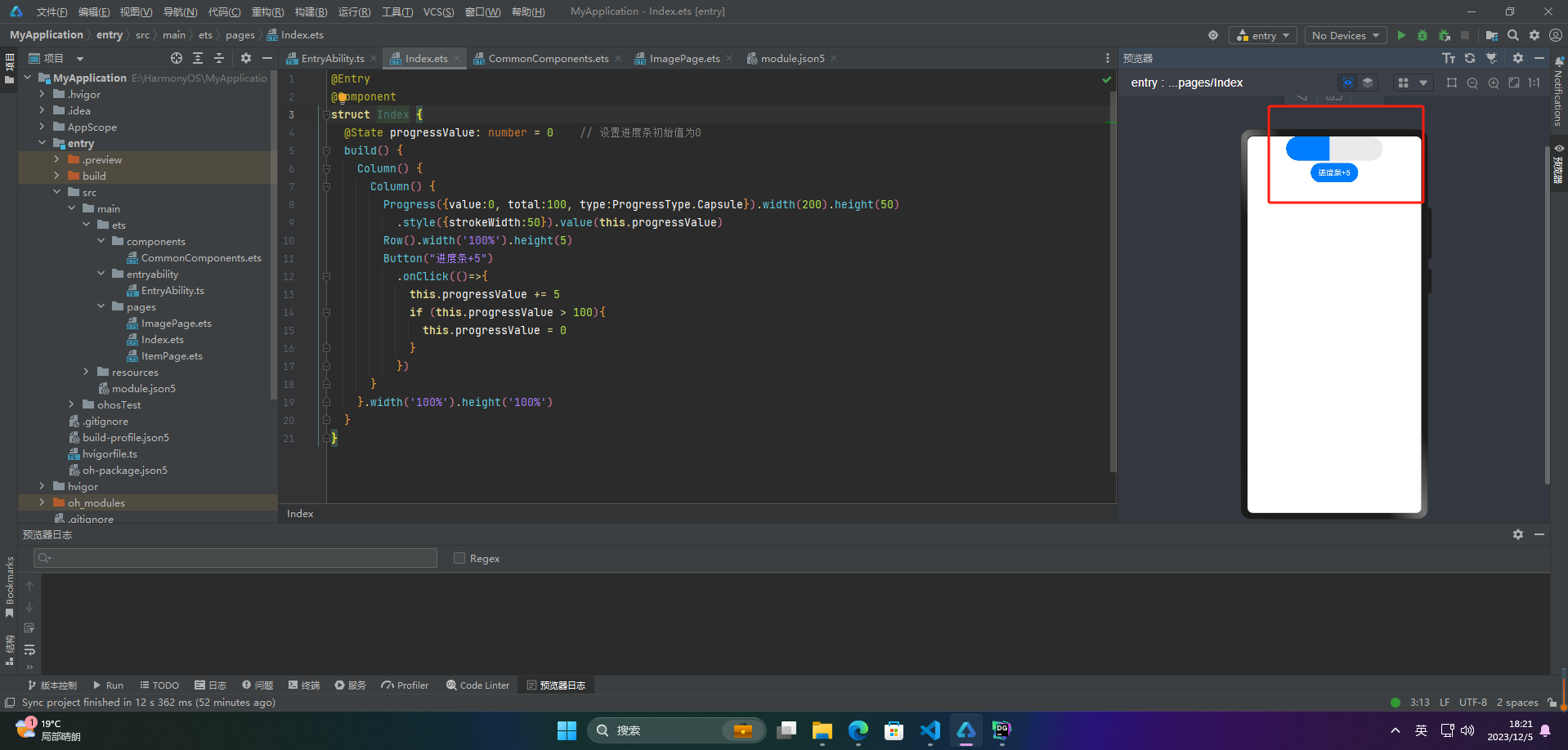
🔎3.案例
Progress组件通常用于展示某个任务或者进程的进度,可以向用户传达当前操作的进展情况。以下是Progress组件的一些实际应用场景:
- 文件上传或下载的进度条展示
- 音视频播放器中的播放进度条
- 游戏中的加载进度条
- 网页加载进度条
- 软件安装或更新的进度条展示
- 数据库操作的进度条展示
- 任务管理系统中的进度展示
- 项目管理系统中的任务进度展示
Progress组件可以直观地展示某个任务的完成情况,帮助用户了解任务的进度及剩余时间,提高用户体验和操作效率。
案例:
@Entry
@Component
struct Index {
  @State progressValue: number = 0    // 设置进度条初始值为0
  build() {
    Column() {
      Column() {
        Progress({value:0, total:100, type:ProgressType.Capsule}).width(200).height(50)
          .style({strokeWidth:50}).value(this.progressValue)
        Row().width('100%').height(5)
        Button("进度条+5")
          .onClick(()=>{
            this.progressValue += 5
            if (this.progressValue > 100){
              this.progressValue = 0
            }
          })
      }
    }.width('100%').height('100%')
  }
}
🚀写在最后
- 如果你觉得这篇内容对你还蛮有帮助,我想邀请你帮我三个小忙:
- 点赞,转发,有你们的 『点赞和评论』,才是我创造的动力。
- 关注小编,同时可以期待后续文章ing🚀,不定期分享原创知识。
- 更多鸿蒙最新技术知识点,请关注作者博客:https://t.doruo.cn/14DjR1rEY