鸿蒙HarmonyOS实战-ArkUI组件(CustomDialog)
🚀一、CustomDialog
CustomDialog组件是一种自定义对话框,可以通过开发人员根据特定的要求定制内容和布局。它允许开发人员创建一个完全可定制的对话框,可以显示任何类型的内容,例如文本、图像、表单和按钮。
CustomDialog通常用于在执行任务之前向用户提供额外的信息或输入选项,例如确认删除操作或输入登录凭据。它们还可以用于创建弹出窗口来显示信息或广告。
CustomDialog通常涉及创建一个新的布局文件,并扩展Dialog类来自定义其行为和外观。
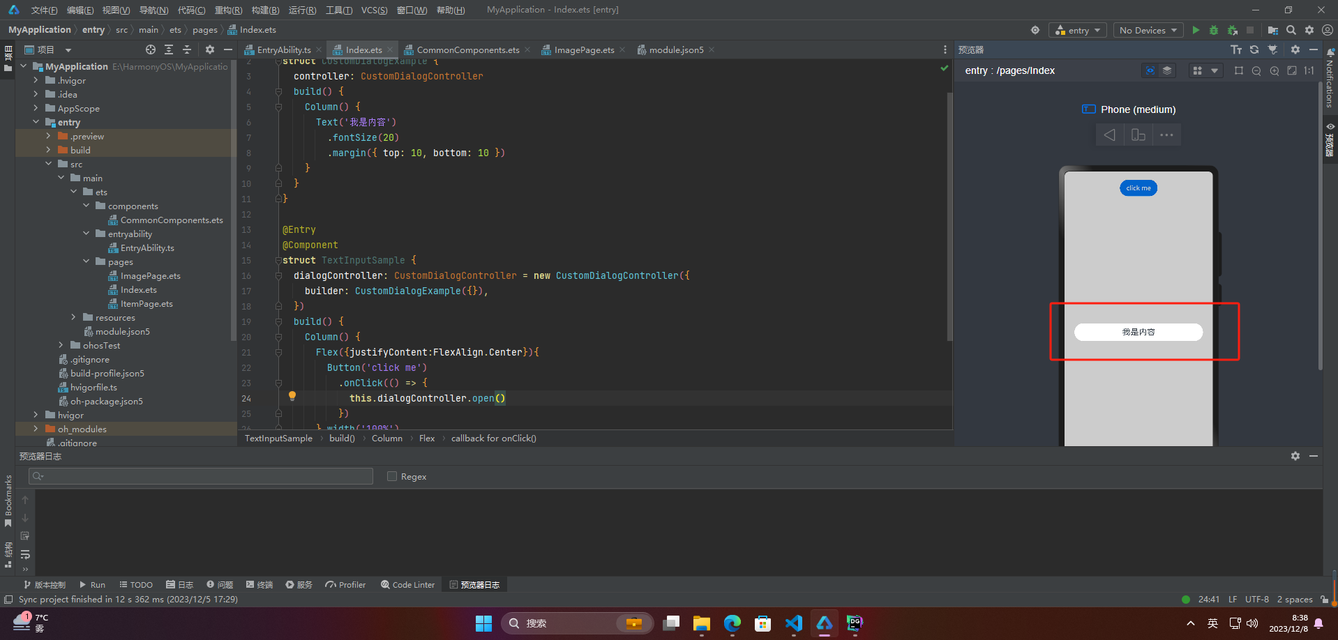
🔎1.创建自定义弹窗
HarmonyOS的@CustomDialog是一个自定义对话框控件,它可以帮助开发人员快速创建各种各样的对话框,包括提示框、确认框、输入框等。
使用@CustomDialog,开发人员可以自定义对话框的标题、消息、按钮、图标等属性,以及对话框的样式和布局。此外,它还支持自定义对话框的背景、动画和触发事件等属性,以满足不同场景的需求。
@CustomDialog
struct CustomDialogExample {
  controller: CustomDialogController
  build() {
    Column() {
      Text('我是内容')
        .fontSize(20)
        .margin({ top: 10, bottom: 10 })
    }
  }
}

@Entry
@Component
struct TextInputSample {
  dialogController: CustomDialogController = new CustomDialogController({
    builder: CustomDialogExample({}),
  })
  build() {
    Column() {
      Flex({justifyContent:FlexAlign.Center}){
        Button('click me')
          .onClick(() => {
            this.dialogController.open()
          })
      }.width('100%')
    }.padding(20)
  }
}
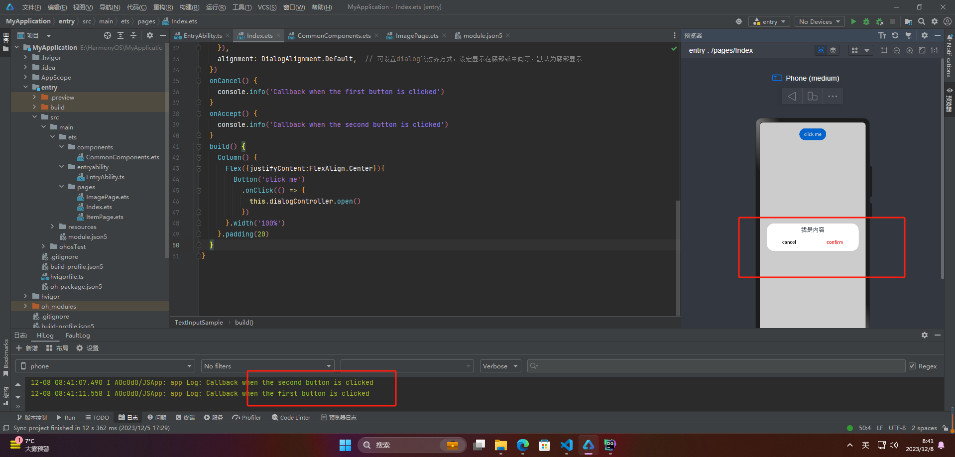
🔎2.弹窗的交互
弹窗数据交互的作用包括提高用户体验、简化流程、提高交互性、实现数据交互和优化UI设计等。它可以在用户操作过程中快速展示信息或选项,减少操作繁琐度和时间成本;同时作为数据交互的桥梁,传递用户输入或选择的信息进行处理,展示需要的信息给用户。弹窗数据交互可以提供灵活的交互形式,同时也可以通过多样化的UI设计形式实现独特的设计效果。
@CustomDialog
struct CustomDialogExample {
  controller: CustomDialogController
  cancel: () => void
  confirm: () => void
  build() {
    Column() {
      Text('我是内容').fontSize(20).margin({ top: 10, bottom: 10 })
      Flex({ justifyContent: FlexAlign.SpaceAround }) {
        Button('cancel')
          .onClick(() => {
            this.controller.close()
            this.cancel()
          }).backgroundColor(0xffffff).fontColor(Color.Black)
        Button('confirm')
          .onClick(() => {
            this.controller.close()
            this.confirm()
          }).backgroundColor(0xffffff).fontColor(Color.Red)
      }.margin({ bottom: 10 })
    }
  }
}

@Entry
@Component
struct TextInputSample {
  dialogController: CustomDialogController = new CustomDialogController({
    builder: CustomDialogExample({
      cancel: this.onCancel,
      confirm: this.onAccept,
    }),
    alignment: DialogAlignment.Default,  // 可设置dialog的对齐方式,设定显示在底部或中间等,默认为底部显示
  })
  onCancel() {
    console.info('Callback when the first button is clicked')
  }
  onAccept() {
    console.info('Callback when the second button is clicked')
  }
  build() {
    Column() {
      Flex({justifyContent:FlexAlign.Center}){
        Button('click me')
          .onClick(() => {
            this.dialogController.open()
          })
      }.width('100%')
    }.padding(20)
  }
}
🔎3.案例
// xxx.ets
@CustomDialog
struct CustomDialogExample {
  controller: CustomDialogController
  cancel: () => void
  confirm: () => void
  build() {
    Column() {
      Text('我是弹窗案例').fontSize(20).margin({ top: 10, bottom: 10 })
      Flex({ justifyContent: FlexAlign.SpaceAround }) {
        Button('取消')
          .onClick(() => {
            this.controller.close()
            this.cancel()
          }).backgroundColor(0xffffff).fontColor(Color.Black)
        Button('确认')
          .onClick(() => {
            this.controller.close()
            this.confirm()
          }).backgroundColor(0xffffff).fontColor(Color.Red)
      }.margin({ bottom: 10 })
    }
  }
}

@Entry
@Component
struct DialogExample {
  dialogController: CustomDialogController = new CustomDialogController({
    builder: CustomDialogExample({
      cancel: this.onCancel,
      confirm: this.onAccept,
    }),
    alignment: DialogAlignment.Default,  // 可设置dialog的对齐方式,设定显示在底部或中间等,默认为底部显示
  })
  onCancel() {
    console.info('取消')
  }
  onAccept() {
    console.info('确认')
  }

  build() {
    Flex({ justifyContent: FlexAlign.Center }) {
      Button('点我')
        .onClick(() => {
          this.dialogController.open()
        })
    }.width('100%')
  }
}

🚀写在最后
- 如果你觉得这篇内容对你还蛮有帮助,我想邀请你帮我三个小忙:
- 点赞,转发,有你们的 『点赞和评论』,才是我创造的动力。
- 关注小编,同时可以期待后续文章ing🚀,不定期分享原创知识。
- 更多鸿蒙最新技术知识点,请关注作者博客:https://t.doruo.cn/14DjR1rEY

热门相关:弃妇种田忙 校花之高手无敌 史上最强赘婿 甜蜜婚令:陆少的医神娇妻 史上第一密探